SOURCE-CHECKED · EVERYDAY TECH
How to make text bigger in Windows 11 without enlarging everything
Choose Windows 11 Text size or Scale with a measured browser comparison, an actual-app reading check, and separate Edge zoom and Magnifier controls.
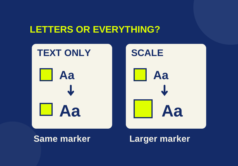
If file names, menus, and other labels are hard to read but icons and controls are already comfortable to use, start with Windows 11’s Text size setting. Use Scale when the apps and images also need to be larger.
The text and interface comparison lets you see the distinction before changing a setting. It shows three browser examples side by side: an unchanged sample, one with larger letters, and one with the whole sample enlarged. The page is a CSS demonstration, so its percentages illustrate the difference rather than predict what your Windows screen will look like.
Compare the letters and the marker
Open the comparison page and keep your browser zoom unchanged while you switch among 100%, 125%, and 150%. Watch the text label, the gold geometric marker, and the button in each panel.
| CSS demo setting | Larger-letters panel | Whole-sample panel |
|---|---|---|
| 100% | Label: 16 CSS px; marker: 24 CSS px | Label: 16 CSS px; marker: 24 CSS px |
| 125% | Label: 20 CSS px; marker: 24 CSS px | Label: 20 CSS px; marker: 30 CSS px |
| 150% | Label: 24 CSS px; marker: 24 CSS px | Label: 24 CSS px; marker: 36 CSS px |
At 125%, both changed panels have a 20 CSS px label. The difference is the marker: it stays at 24 CSS px when only letters grow, but reaches 30 CSS px when the whole sample grows. The button shows a related difference. In the letters panel, its text grows within the existing padding; in the whole-sample panel, its text and padding grow.
Check which sample solves your reading difficulty and whether its controls are comfortable to locate and click. The gold square represents size; it is not a Windows folder icon.
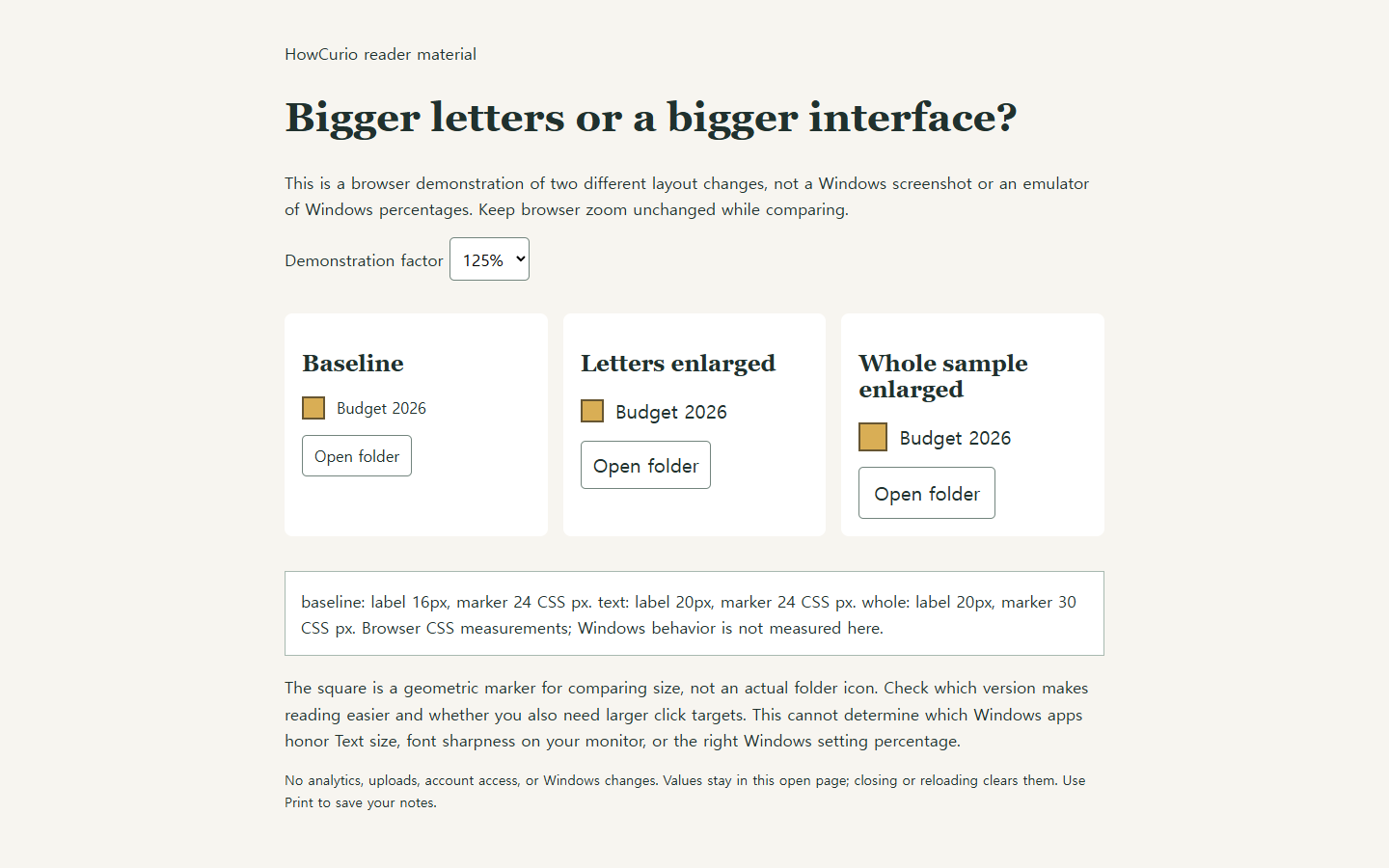
Actual browser capture of the comparison at its 125% demonstration setting.
Change only the Windows text size
Before changing a setting, note its current value so you can return to it. Then press Windows key + U, open Text size under Accessibility, and move the slider a modest amount. Check the preview, select Apply, and read the text you actually use.
Microsoft’s accessibility instructions describe Text size for titles, menus, and icon labels. That makes it the relevant first setting when, for example, a file name beneath an icon is difficult to read but the icon itself is large enough.
Check an actual file name after applying the change, rather than judging only from the Settings preview. Try one toolbar button and a paragraph in an app you use, too. Check each place you actually use, because the result in one app cannot establish how all other apps respond.
Larger letters also need more room. A long file name might wrap or be cut off differently even when the icon has not grown. When comparing before and after, keep the window width, folder, and view the same. Otherwise, a change in available space can look like an effect of the text setting.
Suppose you can comfortably click a folder icon, but cannot distinguish the end of “Budget 2026 - draft.xlsx” from “Budget 2026 - approved.xlsx” in the current view. Compare those exact names after one text adjustment. If the letters are readable but the ending is cut off, give the name more room in that view before increasing the percentage again. The reading problem has changed from small letters to insufficient space for the label. If you instead struggle to locate and click the folder itself, include the icon and toolbar targets in your next comparison. These are observations you can make on your own PC; the browser marker cannot answer them for you.
When Scale is the better fit
If the words, controls, and images all feel too small, examine Scale instead. Press Windows key + I, go to System > Display, and find Scale under Scale & layout. Microsoft describes Text size and Scale as separate options; Scale enlarges apps and images as well as text.
Because enlarging more of the interface changes how much fits in a window, compare the same file label, toolbar button, and paragraph after any Scale change. Use the original value you recorded if the result does not suit you.
If one place still looks small
If the problem is limited to a webpage in Edge, use Settings and more > Zoom to adjust that page. Ctrl + 0 resets its zoom to the default. Microsoft’s Edge accessibility guide documents those controls. Keep that separate from the Windows comparison: changing browser zoom while using the demonstration enlarges the demonstration itself and makes its side-by-side measurements harder to interpret.
For temporary inspection, Windows Magnifier offers another route. Windows key + Plus opens it and zooms in, Windows key + Minus decreases magnification, and Windows key + Esc closes it. Magnifier helps you inspect something briefly; Text size and Scale change the layout you continue using.
If one app appears unchanged after a Text size adjustment, save your work and inspect it again at its next normal relaunch. This is a suggested observation step, not an established fix for that app. For Scale changes, Microsoft notes that some apps may require signing out and back in before responding. Plan any sign-out for a suitable time and save open work first, particularly on a managed PC.
Source note: Microsoft’s text and app size guidance and Windows text-size instructions were checked October 7, 2026 KST. The linked comparison’s interaction, CSS measurements, and layout at 320, 390, and 1440 CSS px were verified in Chromium. No Windows setting or native Windows screen was tested.
KEEP GOING
More to explore.
SOURCE-CHECKEDEveryday tech
How to turn off one app's Windows 11 notifications without silencing everything
Silence the sender you meant to change, with a local preview of app, banner, sound and Notification Center controls.
SOURCE-CHECKEDEveryday tech
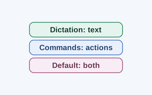
Dictate text with Windows Voice Access without triggering commands
Dictation mode treats spoken input as text in an editable field. Commands mode is for actions; Default mode handles both commands and dictation.