SOURCE-CHECKED · APPS & THE WEB
Google Art Palette: find art by color and build a usable palette
Find art through Google Art Palette, compare two museum works with downloadable color data, and turn five colors into a reading palette with measured contrast.
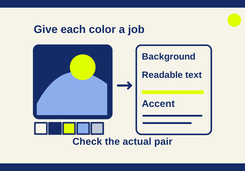
Google Art Palette lets you search for artworks using five chosen colors. You can begin with a color combination even when you do not know an artist’s name or a painting’s title. Open a work’s museum record, then decide which colors belong in your own project. A reading page, for example, needs a comfortable background and legible text; five colors that look appealing together will not automatically provide both.
Start with five colors
Open the Art Palette experiment and skip the introduction if it appears. Choose five colors to explore artwork matches. The page also offers Surprise Me and From an image. Google describes the latter as a way to make a palette from a photo; its notice says a color palette from your photo is sent to Google to find matches, and only those colors are stored for the time the search takes.
In one run on October 7, 2026, Surprise Me produced gray, rust, tan, black, and dark gray swatches alongside a grid with many photos of dolls against dark gray or black backdrops. A backdrop can occupy much more space than the object you noticed first. Check the photograph’s background before you borrow colors from the pictured object.
Google’s launch description says Art Palette uses computer vision for matching and offers paths to artwork history. When a result interests you, record its title and artist from its detail page, then check the holding institution’s record. That record is the place to confirm which work you found and whether its image can be reused.
Look beyond the most striking color
The two museum images below are independent examples for examining color and composition. They were selected from museum records, not from the observed Art Palette result grid.
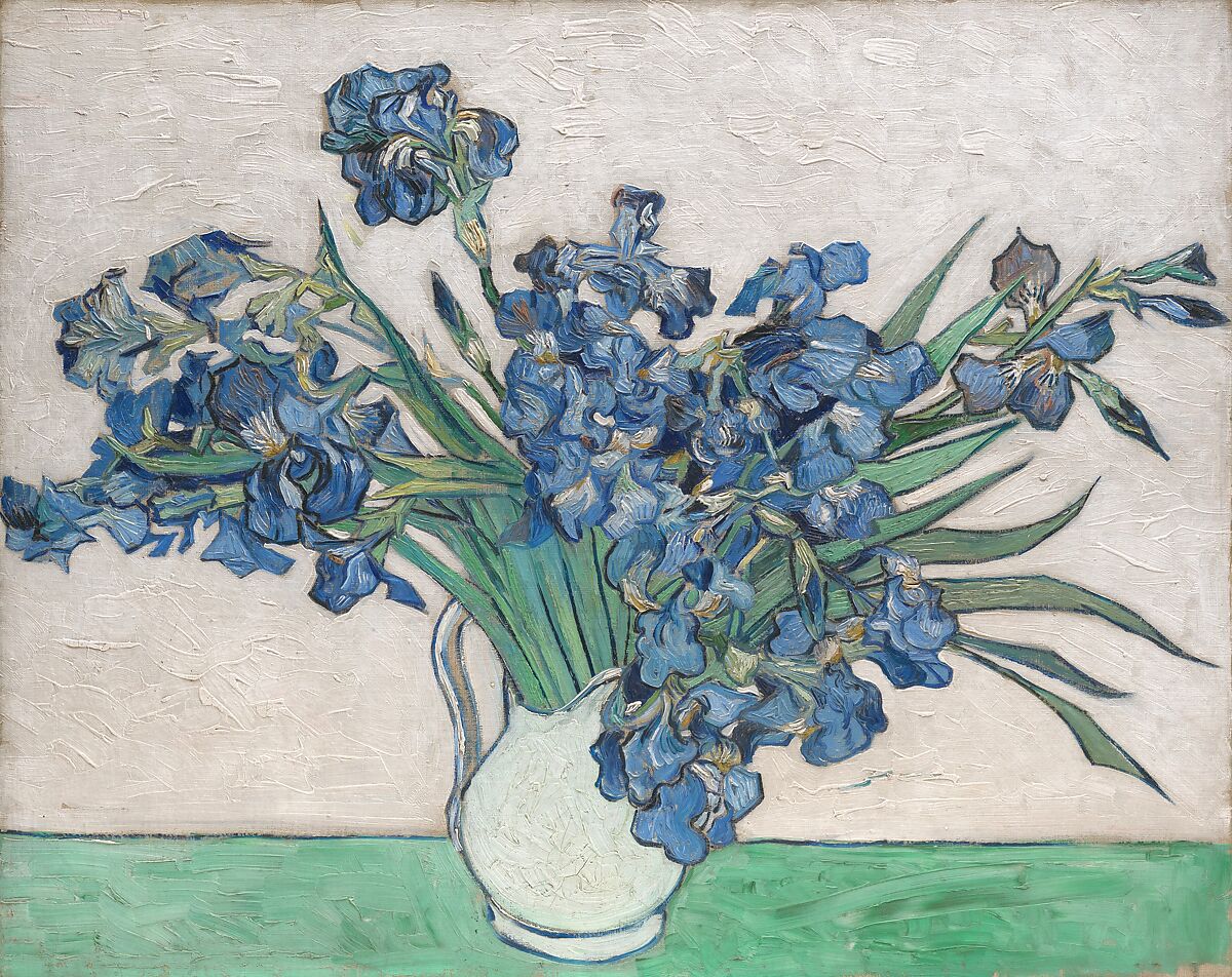
Vincent van Gogh, Irises, 1890, oil on canvas. The Metropolitan Museum of Art, object 58.187; the museum identifies the image as public domain.
The viewed reproduction has clustered blue flowers, green stems, a pale vase, and a broad cream-colored field. The Met notes that red pigments have faded: the flowers were originally violet and the background pink. The blue and cream visible in this digital image therefore should not be treated as a measurement of the painting’s original colors.
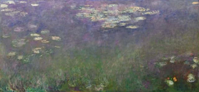
Claude Monet, Water Lilies (Agapanthus), about 1915 to 1926, oil on canvas. Cleveland Museum of Art, accession 1960.81; the museum provides the digital reproduction under its open access terms.
In the viewed reproduction, purple-gray water and green foliage take up most of the frame, while the light lilies are small. The museum notes that the composition has no horizon or banks. If the lilies are what drew you to the image, a palette based on the largest areas may give you much more water and foliage than flower color.
A small local study grouped pixels from each complete reproduction into five RGB color clusters. The images were resized to fit within 120 × 120 pixels before clustering, so the percentages describe these digital files at that size, not original paint or Google’s matching method.
| Reproduction | Five largest RGB clusters, with approximate pixel shares |
|---|---|
| Irises | #dcd6cf 37.5%; #88a898 18.9%; #698586 18.6%; #c5bfb7 13.2%; #48606f 11.8% |
| Water Lilies (Agapanthus) | #6b6b71 31.5%; #606656 28.6%; #807b8d 19.6%; #444a39 12.7%; #a39e9f 7.6% |
The largest Irises cluster is a light neutral, despite the flowers’ visual pull. Monet’s small bright lilies do not appear among the five dominant average clusters. For a reading page, the largest neutral area can become a background while a small flower color becomes an accent. You can download the study’s CSV for the five clusters from each work, or use the JSON version.
Turn the colors into a reading page
Suppose you want the calm light field and darker plant colors of Irises, with a restrained accent, for a page of text. Assign a background, text color and accents before filling the page:
- Use cream
#f2eee6for the page background and dark blue#203f52for body text. - Use purple
#655e83for links. - Keep green
#86a899and rust#a86e50for decorative rules or borders.
These are handpicked example colors, not swatches extracted from the painting or supplied by Art Palette. A swatch sheet shows the five together.
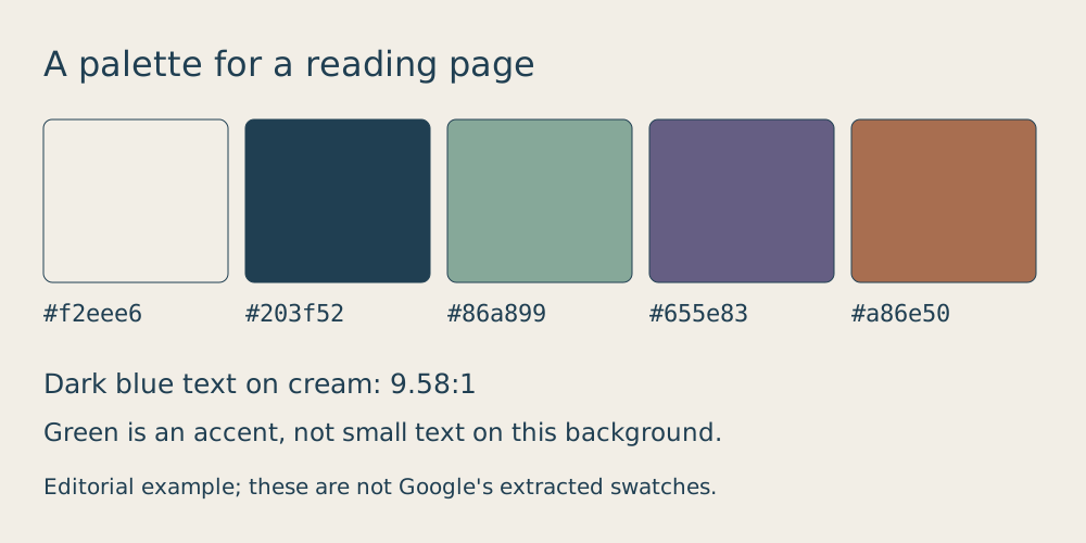
The pairings matter more than the individual hex codes. Calculated contrast against the cream background is about 9.58:1 for the dark blue and 5.21:1 for the purple. The green reaches only 2.25:1 against cream, so it is a poor choice for normal text there. WCAG 2.2’s contrast guidance sets a minimum of 4.5:1 for normal text and 3:1 for large text. Underline links as well as coloring them; a contrast ratio alone does not tell a reader which words are clickable.
For a small HTML page, these rules apply the example without requiring you to sample the image yourself:
body { background: #f2eee6; color: #203f52; }
a { color: #655e83; text-decoration: underline; }
.decorative-rule { border-top: 3px solid #86a899; }
The green rule carries no text or essential status information. If you use green for a button label or warning instead, check its actual text/background pair separately. The same hex code can work as decoration and fail when it carries words.
If you make your own version, ask which color fills the image, which small color you want readers to notice, and which pair will carry the text. Save the artist, full title, museum, and object or accession number alongside your palette. Those details help you find the same work again, especially when a title such as Water Lilies could point to more than one image.
Image rights need the same work-specific check. The Met identifies its Irises image as public domain, and the Cleveland Museum of Art says its open access image may be copied, modified, and distributed. Google’s partner guidance says uploading partners keep their rights; finding an artwork through Arts & Culture does not give every image the same reuse terms.
Checked October 7, 2026: the public experiment’s Skip intro and Surprise Me controls, official product and museum records, and the two downloaded museum reproductions. The local five-cluster study used each complete image resized within 120 by 120 pixels, then 30 iterations of RGB clustering. It does not measure original pigments or reproduce Google’s matching algorithm; photo upload was not tested.
KEEP GOING
More to explore.
SOURCE-CHECKEDApps & the web
Find wheelchair-accessible transit options in Google Maps
Google documents a transit route option on computers and Android. Its Android guidance also explains place attributes, which are available only in certain countries.
SOURCE-CHECKEDApps & the web
Google Calendar's free booking page: fit appointments into your week
Offer appointment times from one free booking page. A worked weekly schedule explains lead time, busy events and the limits on checking family calendars.